Hello everyone!  Back with one low-hanging fruit from a series of small improvements on AWM.
Issue: Multiple icons are not UI cohesive, are outdated and look pixelated
Proposal: Update them with FontAwesome icons in our current IconTheme
JIRA issue | XWiki Design page
Outdated icons in AWM

What icons we should have instead for these cases
Based on the available icons in the IconTheme:
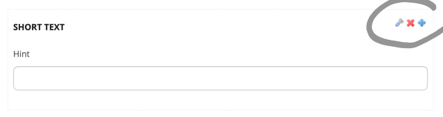
Icons in picture 1 (adding fields in step 2)
- Configure icon - should be
![1730994445750-173.png]() or
or ![1730994470677-833.png]() or
or ![1730994490451-975.png]() (wrench would be closest) → fa-wrench
(wrench would be closest) → fa-wrench - Delete icon - should be
![1730994426337-404.png]() and still red → fa-times
and still red → fa-times - Move icon - should be
![1730994558188-413.png]() or preferably the normal move icon but I cannot find it or we don not have it → fa-arrows-a
or preferably the normal move icon but I cannot find it or we don not have it → fa-arrows-a
 or
or  or
or  (wrench would be closest) → fa-wrench
 and still red → fa-times
 or preferably the normal move icon but I cannot find it or we don not have it → fa-arrows-a
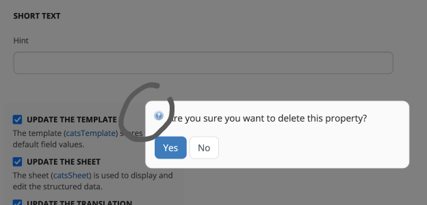
Icon in picture 2 (validating the deletion of a field in step 2):
- Question mark icon - should be
![1730994665813-960.png]() , but it’s also okay if we don’t have any icon → fa-question-circle
, but it’s also okay if we don’t have any icon → fa-question-circle
 , but it’s also okay if we don’t have any icon → fa-question-circle
Icons in picture 3 (all field types in step 2 listed in the right):
- Short text field icon - could be
![1730994990451-636.png]() → fa-font
→ fa-font - Long text field icon - should be
![1730994930551-821.png]() → fa-align-justify
→ fa-align-justify - Number field icon - I don’t think we have a good number icon, but the only one that has a reference to numbers would be
![1731586631362-836.png]()
- Boolean field icon - should be
![1730995328087-143.png]() → fa-check
→ fa-check - Static list icon - should be
![1730995352895-161.png]() → fa-list-ul
→ fa-list-ul - Database List field icon - should be
![1730995377092-609.png]() → fa-database
→ fa-database
 → fa-font
 → fa-align-justify
 → fa-check
 → fa-list-ul
 → fa-database
What do you think
- Do you have another suggestion for the number icon from the IconTheme or from the full FontAwsome list?
- Would you change something else?
3 posts - 2 participants