Hey everyone, here’s a proposal for the commenting UI for Cristal. It follows the basic flow of XWiki Standard, with a few improvements.
Comment area with a single entry
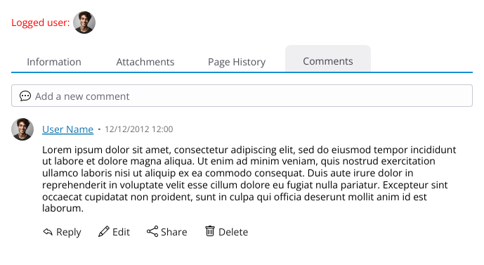
Anatomy of the Comment Component
Each comment consists of several elements:
- User Avatar: Displays the profile image of the commenter.
- User Name: Shows the name of the user who made the comment.
- Date and Time: Indicates when the comment was posted.
- Edits should appear between parenthesis after the original date
- Comment Content: The text of the comment itself.
- Action Bar: Displays different actions a user can take, depending on their permissions. These actions may include:
- Reply
- Edit
- Share: This replaces the previous “link” action but functions the same way.
- This might a personal bias, but I feel that, these days, the action “sharing” is more recognizable as an action that gives the user a link to be shared elsewhere that points to the intended location (a comment in our case)
- Delete

Basic elements of a comment
Behavior of the Commenting System
- Initial State: The commenting area will appear below the document and will be empty initially.
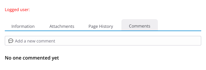
Empty State
-
Add New Comment: Logged-in users with the appropriate permissions will see an “Add new comment” input at the top of the commenting list.
- Clicking this input opens the comment component into editing/adding mode:
- A formatting toolbar becomes visible.
- The text area expands.
- Confirm and Cancel buttons appear.
- After submitting a comment, the system will revert to the default “Add new comment” state.
- Clicking this input opens the comment component into editing/adding mode:
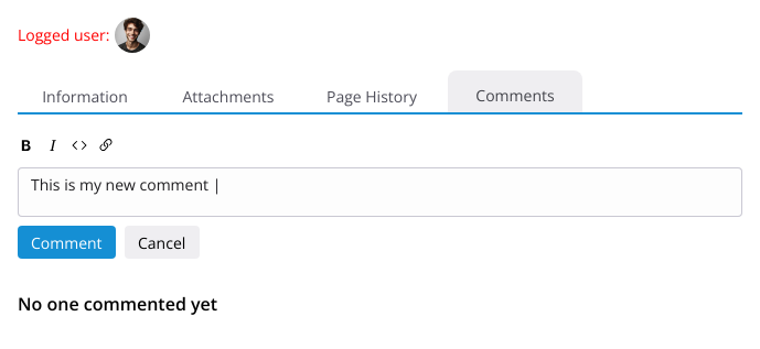
User adding a new comment:
-
Editing Comments: If a user has permission to edit their own comment, the comment will reopen (in place) in edit mode:
- The comment’s content will be pre-filled in the expanded text area.
- The formatting toolbar reappears.
- The action bar will be replaced by Save Edit and Cancel options.
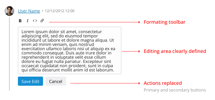
Editing comment UI changes
Thread Line
The thread line helps visually guide users through comment threads and nested replies. As an UI element it was heavily inspired by the comments section of Reddit.
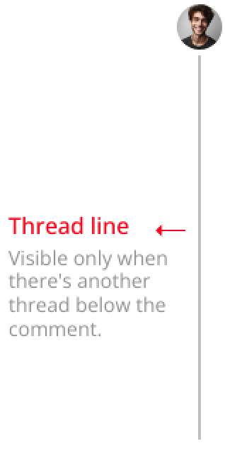
Thread line example
-
The thread line appears when there are:
- Nested comments (replies) under the current comment,
AND - Sibling comments directly following the current comment.
- Nested comments (replies) under the current comment,
-
The thread line serves two purposes:
- It indicates that more comments are available below the current comment.
- It helps users visually follow the progression of a comment thread, showing where the current thread ends and a new one starts.
-
Thread Line Visibility:
- If there are no comments directly below the current one, even if it has nested replies, the thread line will not be displayed.
- If all comments are siblings without any nesting, the thread line will also remain hidden.
Visualization of the thread line on multiple comments (on of the comments is in edit mode)

No thread line is visible on single comments and no nesting

As you can see, the basic behavior of the comment section is not that different from XWiki Standard or other commenting systems.
So, to conclude, I would like your opinions about this proposal as a whole but especially what do you think of:
- Having the “new comment” input always visible (but reduced in size) instead of a button
- Applying a thread line instead of just indenting each nested comment
- Using the “share” sematincs instead of “link”
As always, thank you all for reading.
2 posts - 2 participants