Hi everyone,
Macros are one of the main and most used features of XWiki. In conversations with @surli, we identified a number of pain points in the current macro configuration interface, and I’d like to take this opportunity to propose a potential solution.
Note:
This post serves as a companion to the following discussions:
- https://forum.xwiki.org/t/macro-configuration-standards-ui-ux/14965
- https://forum.xwiki.org/t/macro-integration-ux-proposal/16732
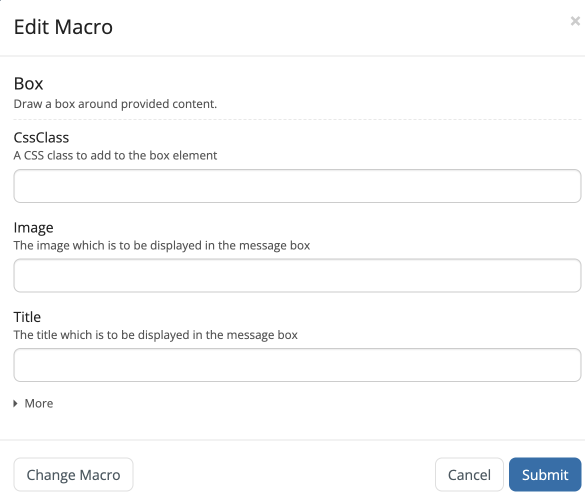
Usability Issues with the Current Macro UI (Configuration Dialog)
- Only a limited number of fields are shown by default
- Inconsistent design patterns that diverge from XWiki’s UI/UX standards (labels, notably)
- The “More” button is too small and easily overlooked
- The ordering of fields is inconsistent—prioritized by recent usage but still capped at three visible fields
- The macro name and description resemble input fields, which can be misleading
- Some required fields are grouped in mutually exclusive sets, but this logic isn’t clearly conveyed to users
Principles to Guide the redesign
- Required fields should be immediately visible
- Field order should remain consistent, regardless of configuration
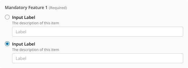
- Mutually exclusive fields should be clearly marked, with user-driven toggles
- The overall form should be as compact as possible
- Modified fields should be visually distinguishable to the user
Proposed Solution
- A new layout that distinctly separates introductory text from input fields
- Required fields are at the top of the interface and never hidden.
- Eliminate the “More” button entirely
- Introduce a tabbed interface to separate optional fields and reduce vertical length
Simple Example: Box Macro
Current UI:

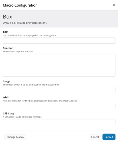
Box Macro with the proposed layout
I reorganized the fields a bit to put the more used ones on top, but this work should be done in a case-by-case scenario.
More Complex Scenario
Here’s a sample scenario drafted by @surli to illustrate more intricate configurations:
Parameter1– MandatoryParameter2– MandatoryParameter3– Part of Mandatory Feature1Parameter4– Part of Mandatory Feature1Parameter5– OptionalParameter6– Optional, part of Group1Parameter7– Optional, part of Group1Parameter8– Part of Optional Feature2Parameter9– Part of Optional Feature2
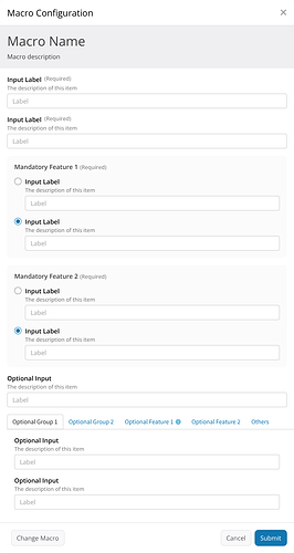
Here’s how the modal configuration dialog might appear:
Yes—it’s complex, but still manageable. This represents a worst-case scenario, helping us evaluate the robustness of the UI rules. Some of the improvements:
Explicit Control for Mutually Exclusive Options

Tabbed Groups for Optional Fields and Features
Change Indicators on Modified Tabs

This approach aims to bring clarity and consistency into the macro configuration experience, I’m looking forward to your thoughts and feedback. If needed, I can propose different scenarios based on these rules.
Thank you all for reading.
1 post - 1 participant


