Improving Session Information and Edit Mode Placement
Currently, session information is displayed at the bottom of the screen. However, this positioning creates usability issues:
- The Edit button is located at the top, but the exit option is at the bottom, causing a disconnect in the workflow.
- Inexperienced users might enter edit mode but struggle to find a way to exit quickly.
Screenshot of the current implementation

Proposed Changes
This proposal integrates session information into the same line as the Edit button, streamlining the experience:
Example

Editing Mode Adjustments:
- When editing, the buttons for attachments, comments, and “More” are hidden. The tabs for these, at the bottom of the document, should still be available
- A “Done” button replaces the “Close” button to indicate workflow completion, reinforcing the concept of making changes and finalizing them.
User List Placement
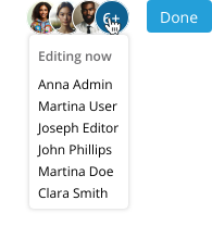
- The list of editing users is moved to the top bar, making collaboration more visible.
- This helps users quickly identify if others are working on the document, reducing conflicts.
- Hovering over or tapping a user’s avatar reveals their username via a tooltip.
- If many users are editing, only a limited number of avatars are shown. A grouping button displays the count of extra users, and hovering over it reveals all usernames to ensure complete visibility.
Saving Information Placement:

- The saving status is placed next to the user list.
- All save-related statuses remain visible as needed, but the “Saved” status disappears after a few seconds (configurable by an Admin). This helps the UI to be cleaner in normal operations.
Full Mockups
View Mode

Edit Mode

Editing and hovering over the user list

Thanks for reading, what do you think of the proposed changes?
4 posts - 3 participants