Hey everyone, here are some initial wireframes for the Cristal UX. Note that this is all still work in progress so if you have any suggestions, please feel free to share them with us. As you may know, Cristal is inspired heavily in personal note taking apps like Notion and Obsidian so you may see the similarities in interface design.
Also, these are wireframes only, so details on visual design are sparse, later we will take these wireframes and apply a design system on top of them to get to the final look and feel of the product.
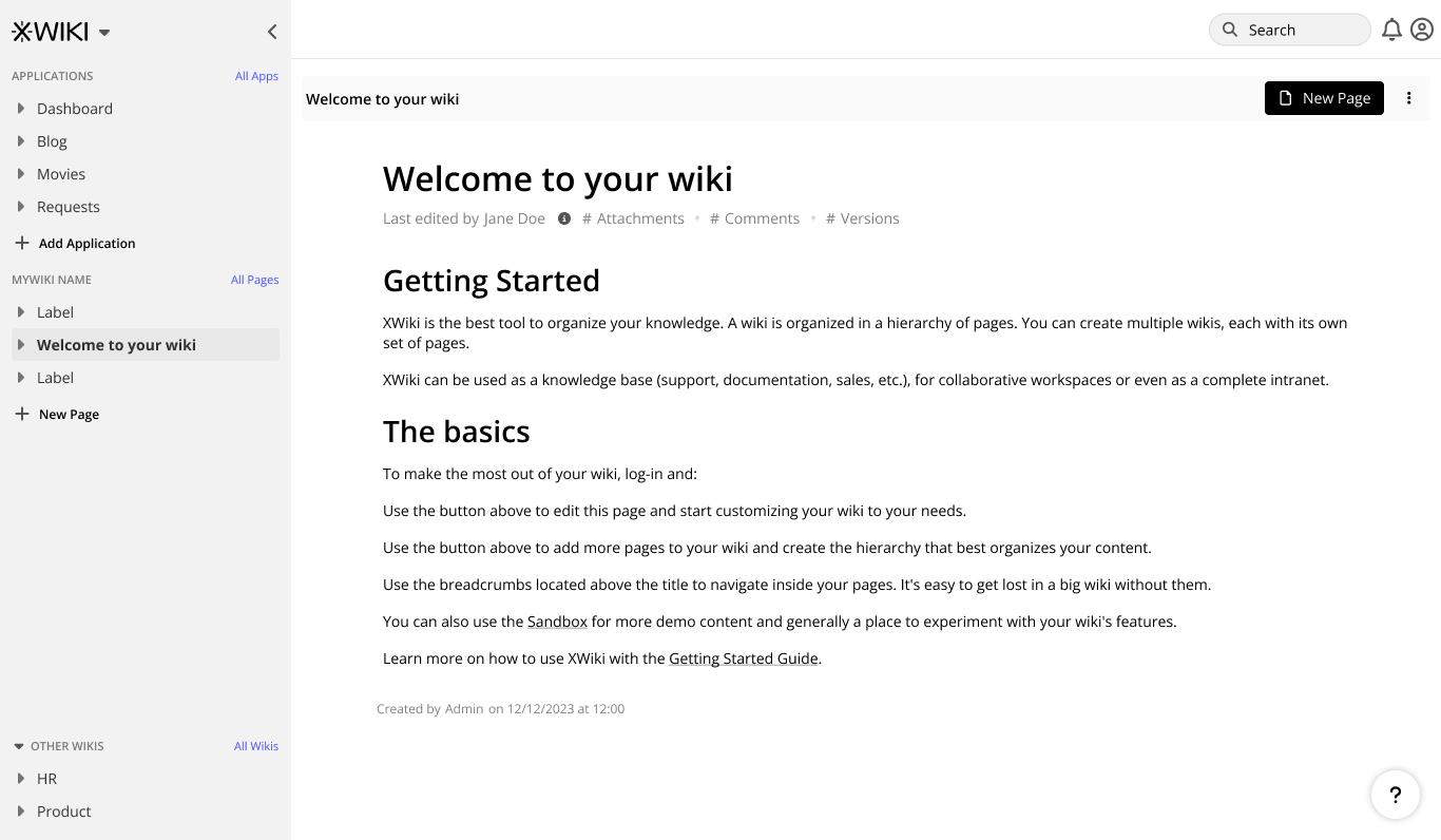
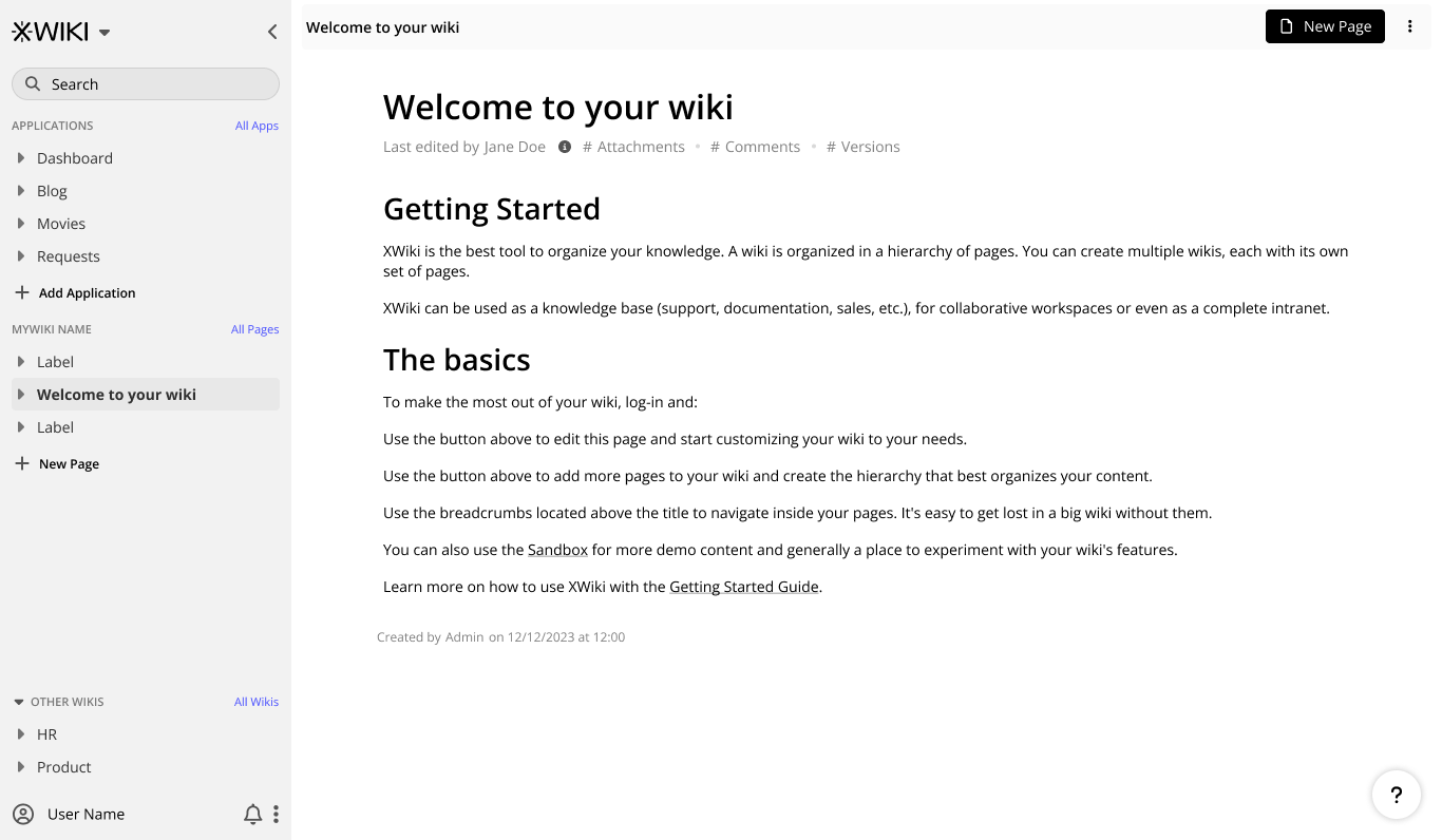
Base layout explorations
Here we have two base layouts to study, the main difference between them is the header bar on the version A and the lack of one on version B. Version B can offer more space to the document, but will make the main sidebar more crowded.
In the final version, only of these will be available.
Version A
Version B
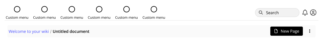
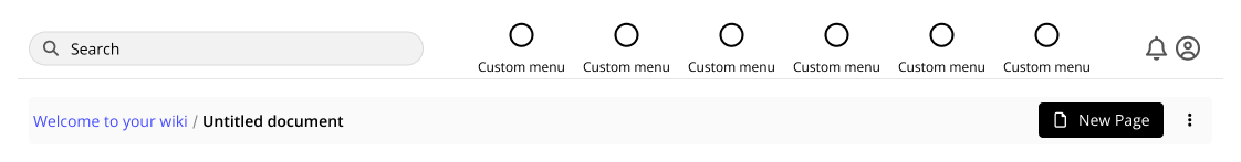
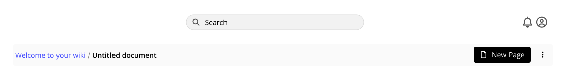
Speaking of header…
Header variations
You can see below some variations on the search bar placement for the header. Two to the sides and one center.
Interestingly, the side variations will allow us to place a custom menu at this header, so it can be good for customizations
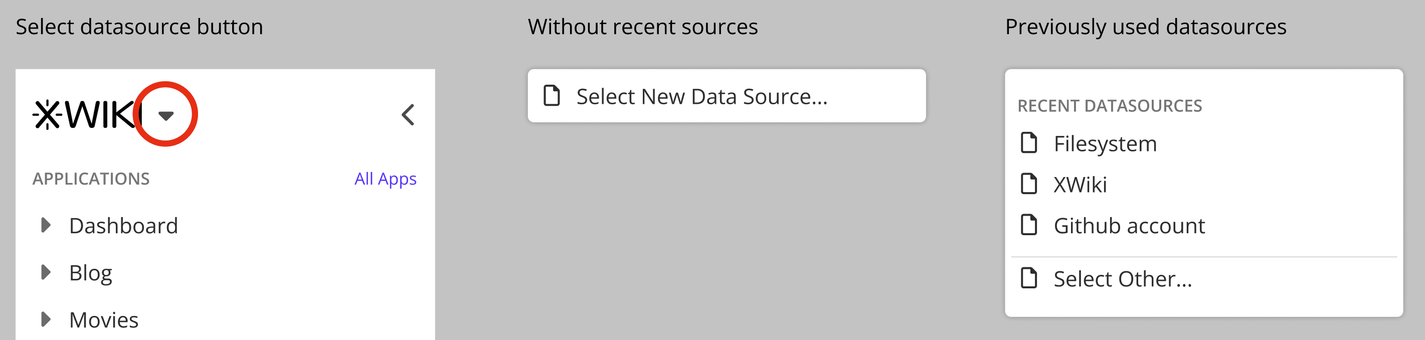
Selecting Datasources
One key aspect of Cristal is the selection of multiple data sources to work with. This can be the local file system, a XWiki instance, a GitHub account and so on. The user will be able to switch these data sources on the fly via a button provided right beside the main logo (that also may be customizable).
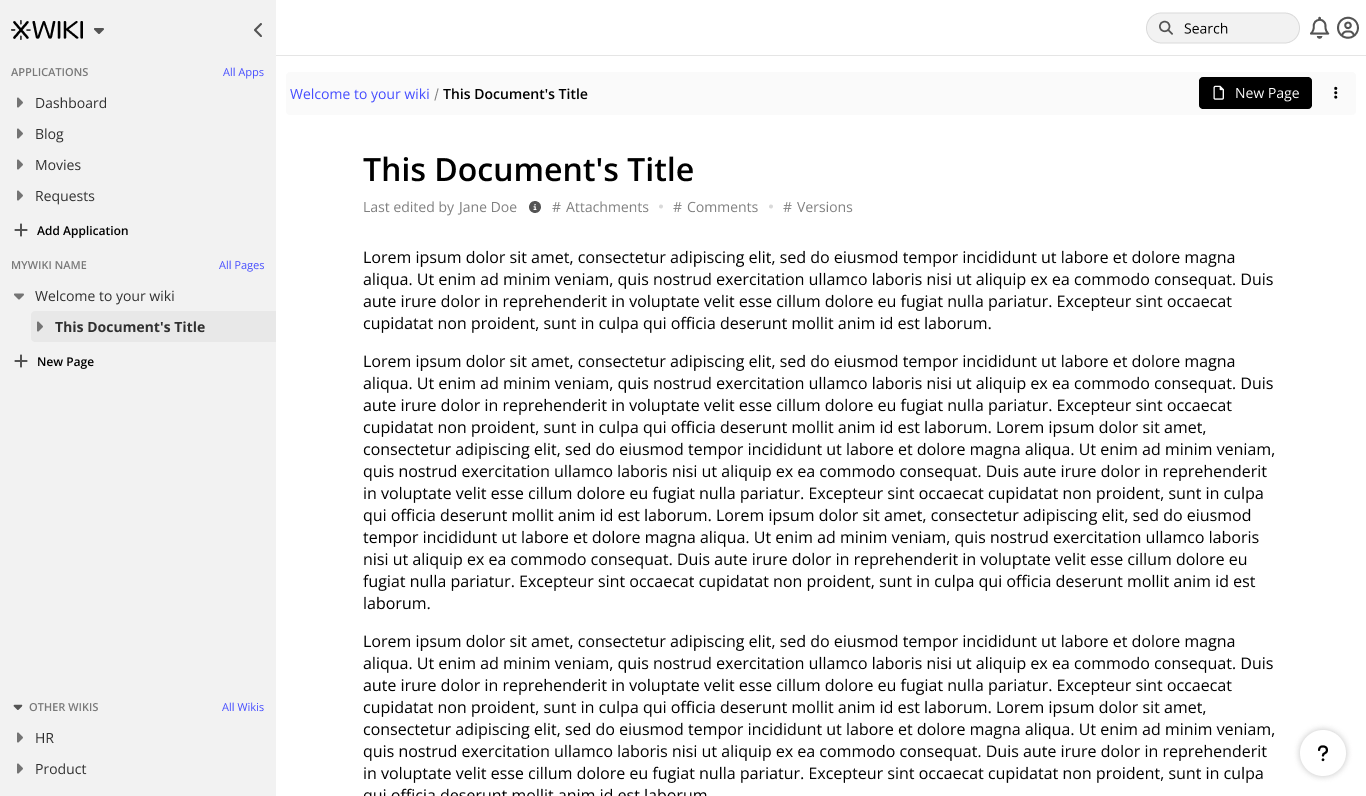
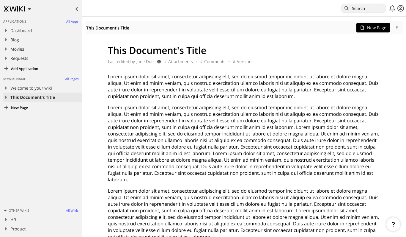
Creating a new page
During research, we saw that a lot of apps have redundant buttons on the interface (like the new button). This allows the user to have more control on the placement of a new page right from the start.
Creating a page from inside a document will place it as a child of that document:
While creating it from the sidebar will place it as a new sibling of the root page:
During page creation we strive to give the most streamlined experience possible to create a simple page. With that in mind, templates will be featured as an option during page creation and the user must explicitly choose that route if desired, note the “Templates” button below.
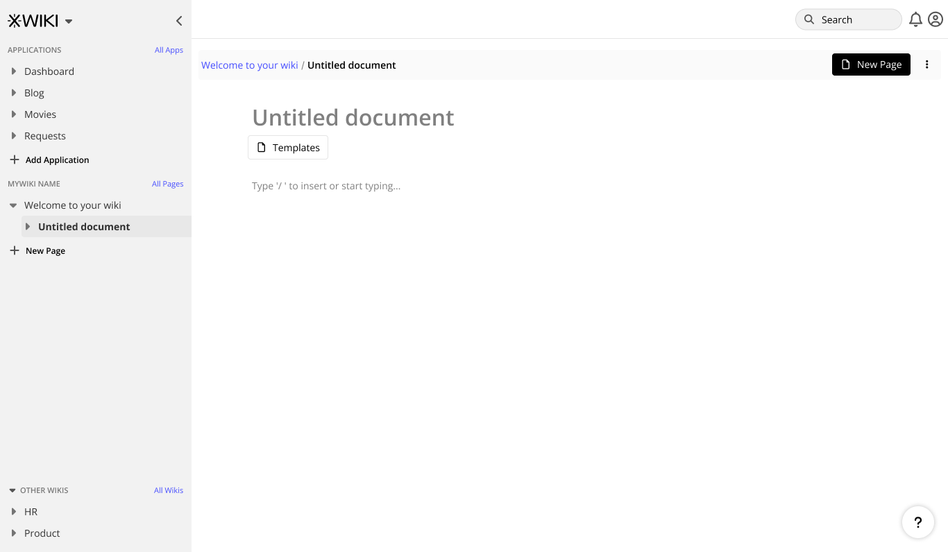
You may also have noticed that the content is centered on the page, this is intended to be the default option to keep line lenght in check, however an option will be provided to make the page full width (both as a document options and user option).
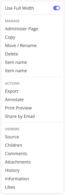
Also, from this menu you will be able to change the page location, if necessary.
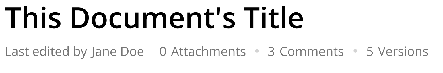
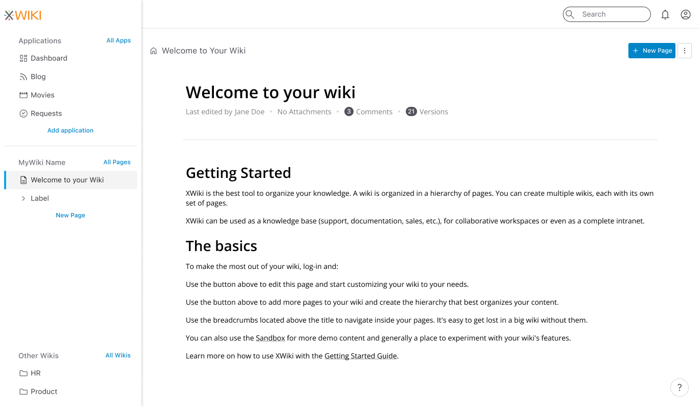
Attachments, Comments and other info
Taking advantage of the extra space provided by the center page, it is possible to open comments, attachments and other relevant info on the document in a sidebar. The sidebar itself, it’s still a work in progress.
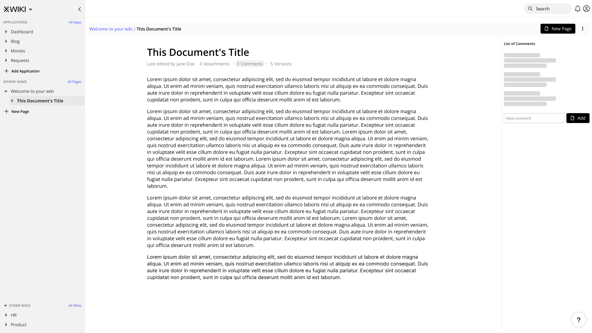
Document info will be presented right below the document’s title. There’s still work to be done on the presentation side of things, especially considering extensions and customizations.
So this is it for now, I hope that I was able to provide a quick introduction to the work going on the interface side of things, and to leave with a small token of things to come, here is an exploration of the proposed interface using the Shoelace design system.
Please, tell us what do you think and see you next time
3 posts - 3 participants